DoctorMatch
Product: iOS app
Scope: End-to-end mobile app
Responsibilities: User research and testing, branding, visual design
Background
Typically, when an individual needs to talk to a healthcare professional, whether it be a general physician or a specialist, they generally get referrals from someone they know. Despite this, they still have no idea if the healthcare professional is seeing patients, what insurance they take, their own values/morals, and other information. Thus, there is a need for a service where individuals can find a healthcare professional that meets their needs on multiple levels.
DoctorMatch intends to be this service. While onboarding, users take a quiz that gives them a “healthcare style type”, which details generally a user’s different behaviors when it comes to finding healthcare. Doctors and other healthcare professionals that are searchable in the app also have “healthcare style types”. Users and doctors that have the same style type are considered compatible and a user is highly likely to be very satisfied with the care received from a compatible doctor.
Problem
People that need access to healthcare, either immediately or in the near future, often have to jump through many hoops to find healthcare professionals that are reliable and work for them both financially and emotionally.
Mission
We want to learn what frustrates people about finding healthcare so that we can create a service that alleviates those frustrations
Primary Research
Research for this project was guided, as it was my first UX project ever. It primarily focused on younger groups and figuring out how they seek out healthcare
Convenience was the biggest obstacle for the target demographic, if a service or provider wasn’t easily accessible, they were hardly considered
Recommendations from family and friends were almost always the go-to for the target demographic
Target demographic was never generally taught what to look for in a doctor or healthcare provider.
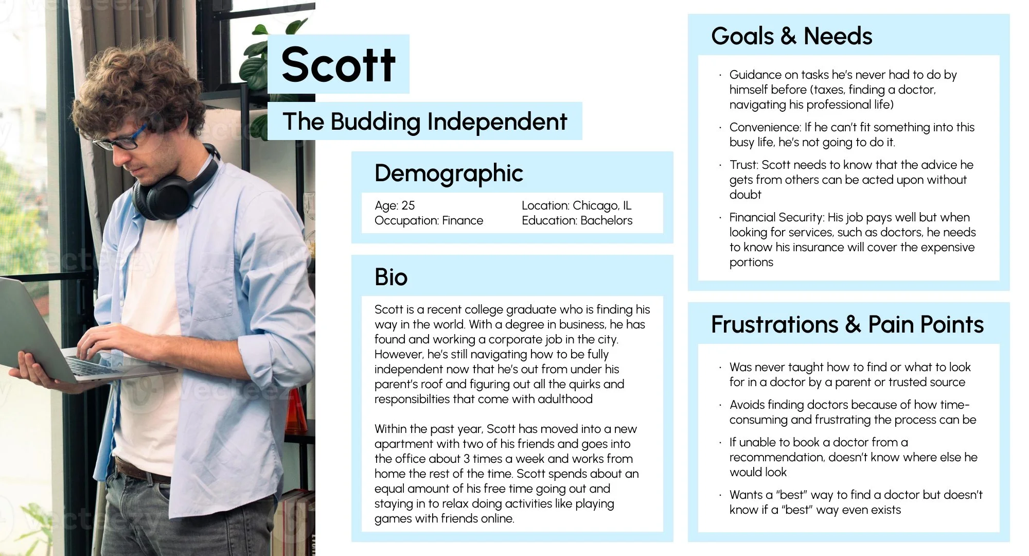
A persona created from the research conducted
Secondary Research
Competitive analysis was the main endeavor for secondary research. There were not many medical provider aggregates on the market, and none with the type of personalization that my platform intends to offer.
Zocdoc would be the biggest competitor, offering to do many of the same functions that DoctorMatch would provide
Other related products on the market had a lot more to do solely with telehealth or had less focus on the consumer
Competitive analysis helped confirm I could carve out a unique and useful offering in the medical space
Laying the Foundation
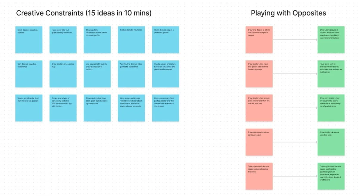
Multiple brainstorming techniques were employed to find useful and unique feature propositions, while task and user flows allowed mapping of the user experience of crucial functions.
The decided on unique proposition was a unique personality test that assigned users a healthcare “style type”
This would allow users to find doctors with the same style type, indicating that they would likely be comfortable with how a matching doctor provides medical care
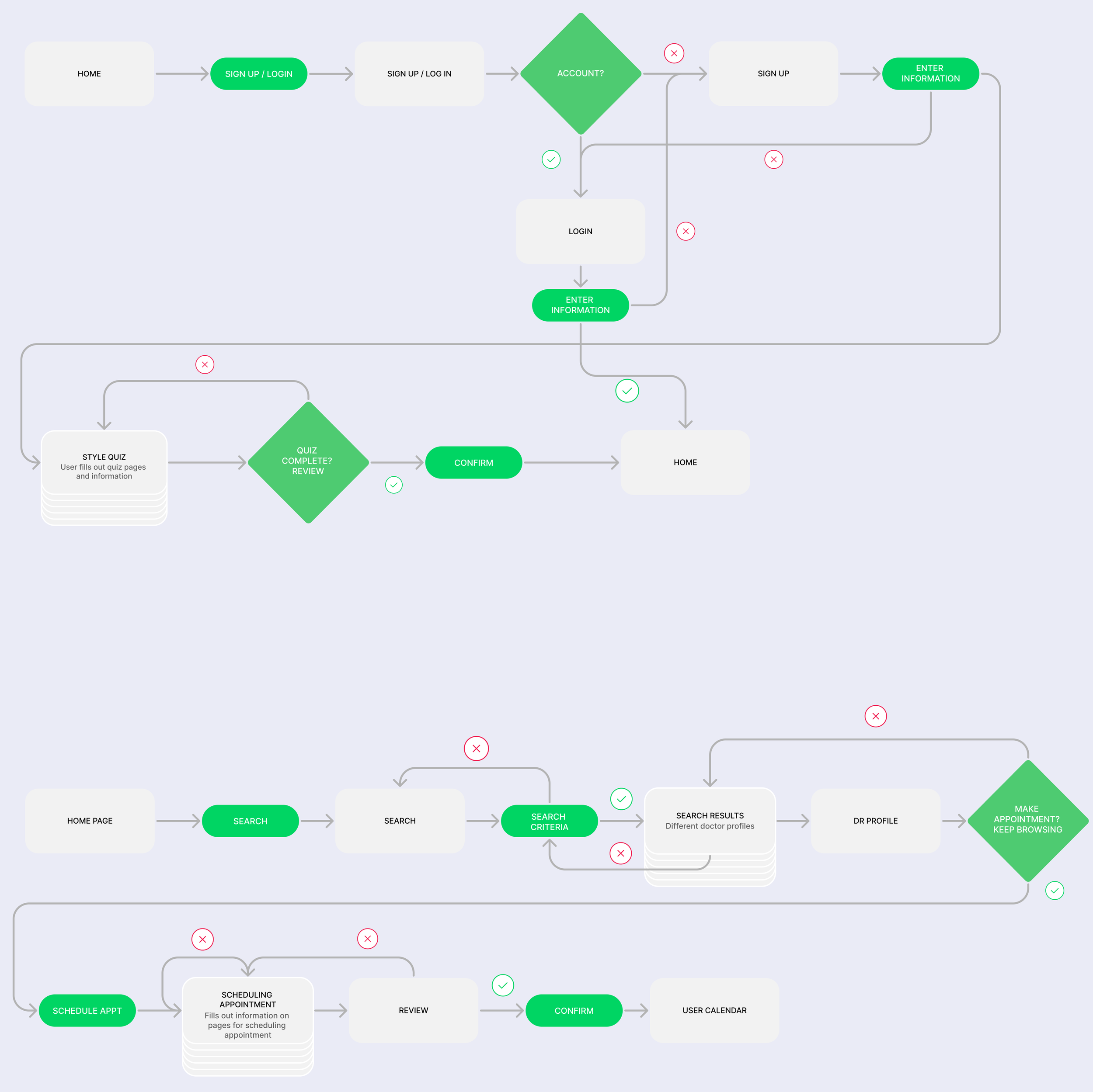
Task and user flows were crucial to get right, as finding healthcare had already proved to be significantly stress-inducing and overly-complex, according to user interviews.
Example task and user flows
Wireframing
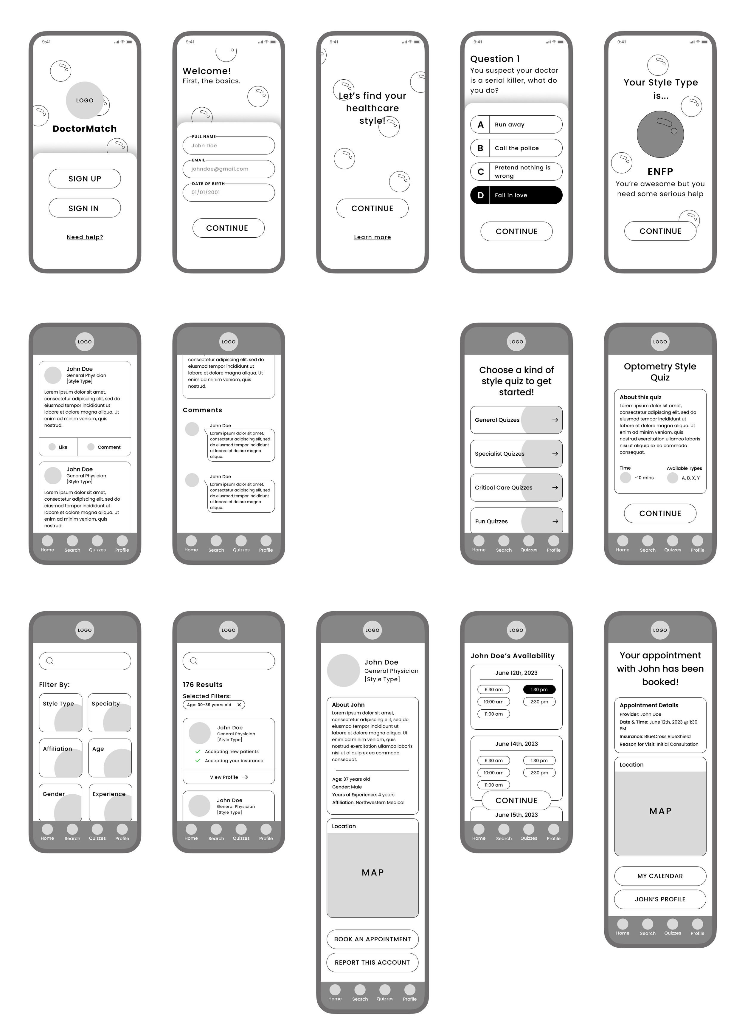
Creating low and mid-fidelity wireframes allows for a low-investment, yet effective way to explore visual and functional design options
Low-fidelity wireframing for the project involved simple sketching and was where I explored what key pages would look like as well as where important elements would go
The bubble motif arose as a way to bring a bit of relaxation in to the platform as I recalled how relaxing it is to watch bubbles float away
Mid-fidelity wireframes allowed me to digitize the low-fidelity ones (reviewed by my mentor and given feedback on), and without color and pictures, it was still low-investment and allowed me to pivot direction should I need to
Branding
As a brand new platform, all elements of a brand needed to be created from scratch.
The logo was created using a common medical symbol, the caduceus staff, with a heart to express care and warmth.
Color palettes were slightly tough to figure out; red was the initial direction but a green proved to fit better and invoked a calming feeling of nature and health.
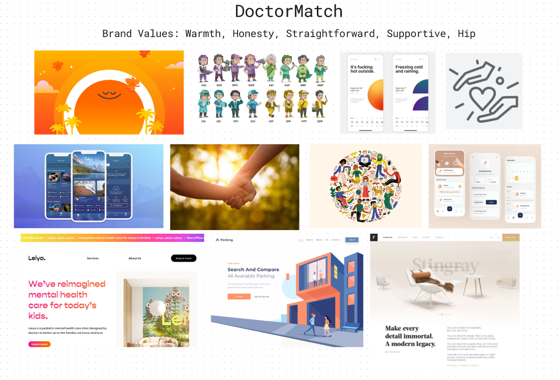
A mood board was also created to nail down a cohesive feel and brand image
Prototyping & Usability Testing
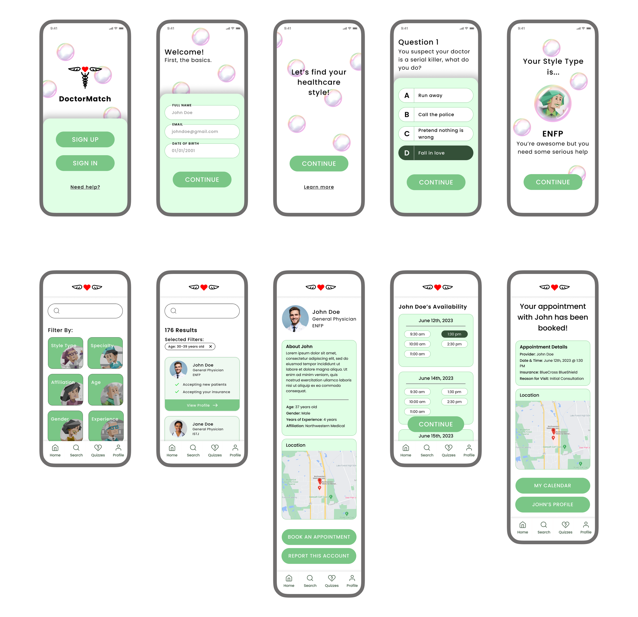
High-fidelity wireframing adds branding elements to the mid-fidelity wireframes. It also sets the groundwork for a working prototype for usability testing
Some placeholder text would also be replaced with meaningful text so in future testing users have a grasp of what they’re looking at.
This was my first time ever implementing a color palette I made, on my own!
Real graphics were also implemented.
First round of high-fidelity wireframes
Usability testing was conducted using the high-fidelity wireframes turned into a working prototype. This was one of the most insightful parts of the process as I received instrumental feedback.
Some of the most important feedback I recieved was as follows:
Uncertainty of what a style type was
Users forgetting what their style type was while browsing the platform
A lack of a search filter based on location (after all we did learn in our research that users heavily prioritize location when searching for a healthcare provider)
Enjoyment of the color palette and logo
The ease of use of the platform was very high
Final Revisions
With the usability testing results analyzed, common themes pulled out and highest impact changes identified, final revisions were able to be made.
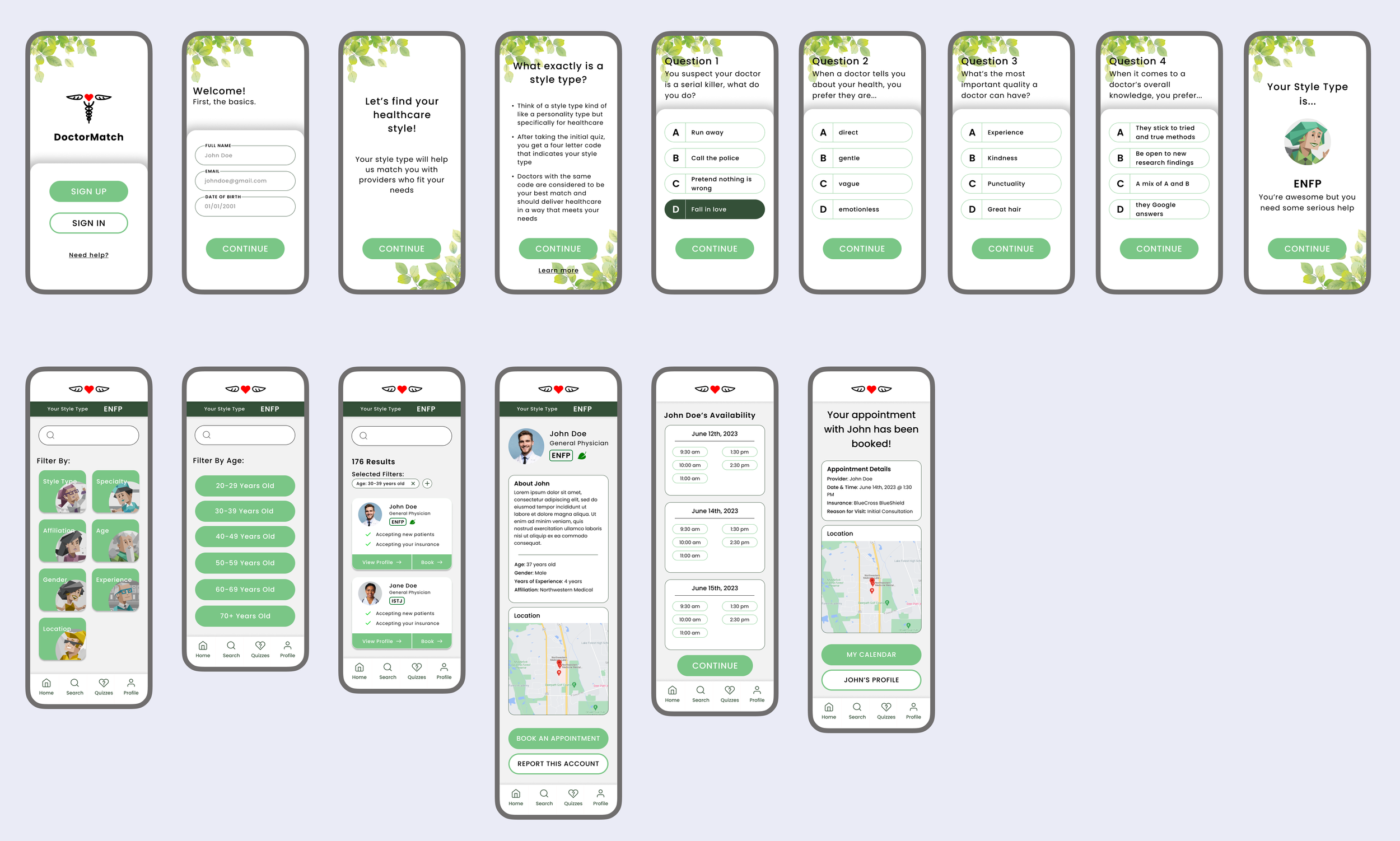
Notable changes were as follows:
A new motif of leaves to fit in more with the themes of nature and healing
Reapplication of the color palette
A new introductory page to what style types are and how they work
A new location filter was added due to a large number of requests from users
A persistent status bar that indicates a user’s style type
A new symbol that appears next to compatible doctors for a user’s style type
A direct booking button on a doctor’s search results card
Takeaways
This project provided me with so much insight and new knowledge on the design process. As a user experience designer, it only becomes more clear to me how taking every user’s feedback at face value contributes so much to making a more complete and intuitive product. With this being my first experience making an end-to-end product, having a higher level of knowledge of each part of the process allows me to heavily consider how the process builds off of itself. Should I work more in-depth on a specific part, I now know how to keep in mind these other parts of the process


