United Mobile
Product: Mobile Website
Scope: Visual redesign
Responsibilities: User research and testing, visual design
Timeline: July - August 2023 (80 hours)
Background
United currently has a mobile site for users looking to travel but, as a growing number of users use their mobile devices to manage their travel, the company wants to make sure that the user flows are smooth and embedded in a solid foundation. The United mobile site redesign is intended to take away some of the bloat and distraction that the current site contains. With the aim to keep simplicity and ease of use at the forefront, the new United mobile experience is intended to allow the user to always know where they are in the process and what the most relevant information is for them.
*This prompt was strictly for education purposes, none of the work displayed below was requested by United.
Problem
Mobile sites for booking travel are relatively new and thus, there are some bumps and frustrations in the process of booking, searching and checking in for a flight
Mission
We want to know how travelers use a travel mobile site so that we can learn how to make the process as smooth as possible.
Primary Research
Initial research involved user surveys and user interviews to understand how users approached multiple functions on an airline’s mobile site
Personas were used to succinctly describe user wants, needs and behaviors within a demographic
Users often found mobile websites to have unnecessary bloat and to be cumbersome to navigate
Many demographics use airline travel for vastly differently reasons, so it was important to focus on specific demographics and their specific reasons for flying.
Competitive analysis helped illuminate what direct competitors considered important to include on their websites as well as how they presented crucial information
Some websites did not properly optimize their mobile sites, with some pages directing users to the desktop version of their site while still being on their phone
There seems to be a lack of standards, some websites seem to highly prioritize and flesh out certain features while others neglect those very same areas
Secondary Research
Laying the Foundation
Iterating on an existing foundation, especially one not by yourself, can be difficult. It was important to thoroughly analyze how current functions and flows worked and spot where improvements could be made.
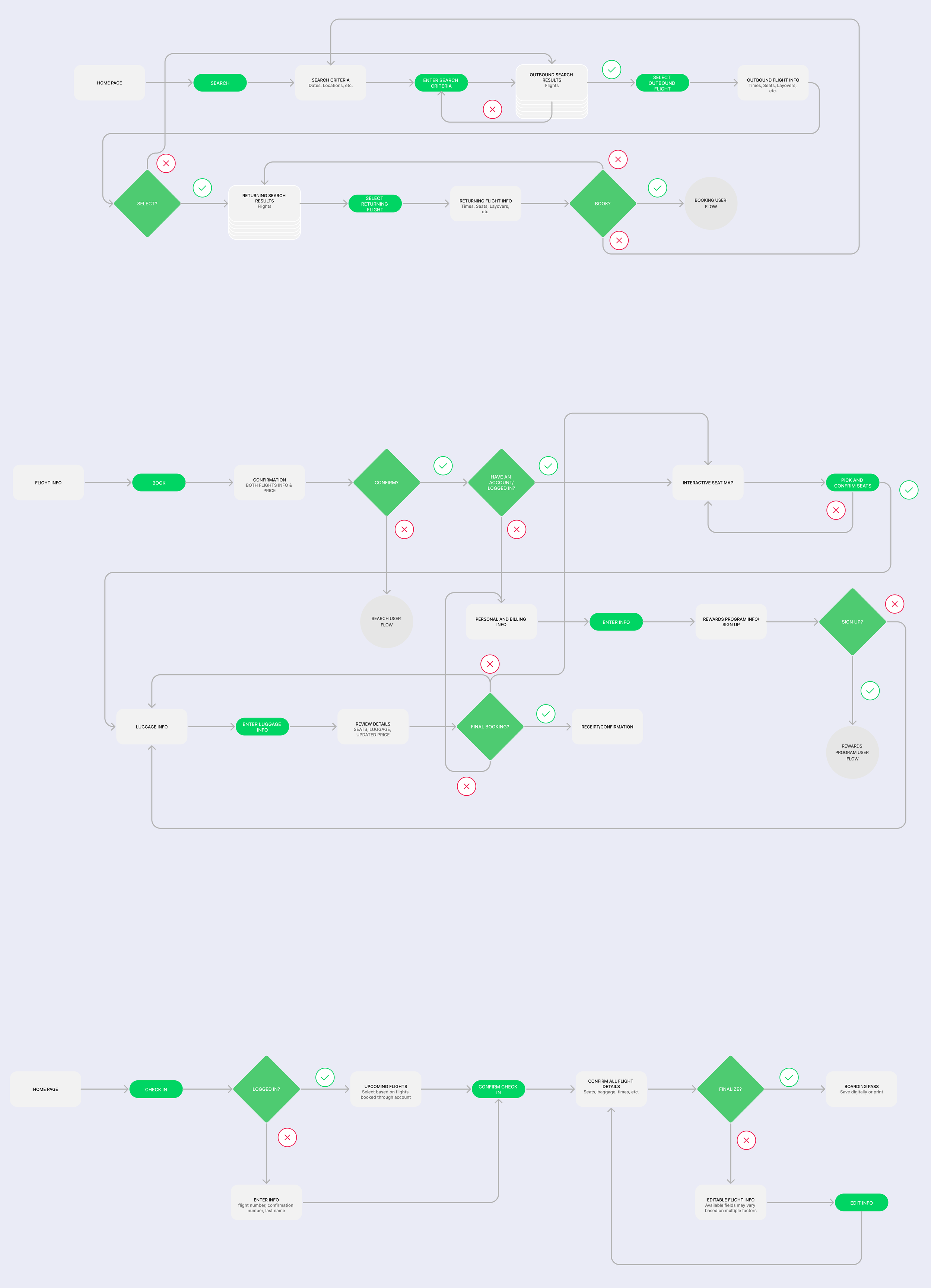
Through the creation of user and task flow maps: we could map out important user journies, how to create ideal versions of them, and spot the differences between the current state and what they could be.
Important user and task flows chosen were: searching for a flight, booking a flight, and checking in for a flight.
These flows also informed us what would be important screens to create and iterate upon for the duration of the design process.
Example task and user flows (condensed for readability)
Wireframing
Low-Fidelity Wireframing
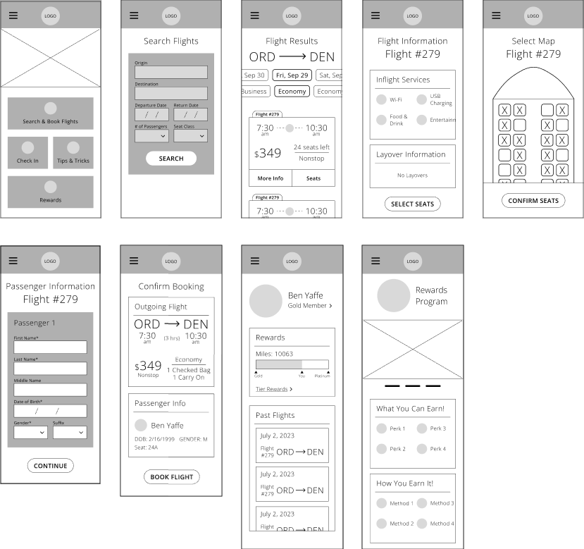
With a design philosophy in mind and new user and task flows as a baseline, it was time to start figuring out how to put these into play with visuals. With low-fidelity wireframing, I was easily able to get significant feedback on the initial direction without investing too many resources.
Mid-Fidelity Wireframing
Given feedback and a solidified direction, we moved into mid-fidelity wireframing. Creating these gave us clean images of the visual design we would use moving forward without the use of color, official text, or logos. All the while continuing to be cautious of the resource investment should any changes need to be made.
Branding
Logos, Text Sets, and Color Palettes
As this project was a redesign of an existing brand; colors, logos, and text sets were all pulled from the existing design, more specifically the desktop site. It was extremely important that the redesign still read visually as a United product.
Prototyping & Usability Testing
Reimplementing the United branding as well as replacing placeholder text upgraded our wireframes to high-fidelity.
Readded branding elements were pulled from the desktop site to keep consistency.
Some icons were to be created from scratch and thus some were missing.
The goal remained for simplicity and readability, even with an established brand
Usability testing was able to be conducted after creating a working prototype out of the high-fidelity wireframes. Focus during these testing sessions was feedback on design elements and comparison to the current mobile offerings of United and other airlines.
Prevalent feedback made by users was as follows:
The selectable seat map is too barren, users want more details before picking their seat and the exact orientation of the plane
Found carbon emissions information distracting and not something they particularly cared about
Wanted to see, or a place to see, a final price breakdown
Wanted more information on the final checkout screen in general
Liked the carousel functionality on the search results screen (date and seat type)
Enjoyed how easy it was to see layover information
Excited about the option to autofill relevant information from their account (where applicable)
Final Revisions
The usability feedback illuminated that in my quest to keep things simple and clean, I may have gone too far in that direction. Instead of users receiving too much information, they were now not getting enough. Many of the changes were aimed at adding in necessary information while still keeping a readable interface that can be deciphered at a quick glance.
Changes for the final revisions include:
Changed colors of buttons on the home screen
Rearranged where roundtrip and one-way buttons were to make more sense
Resized some elements on the carousels to make selected items clearer
Removed carbon emissions information on the search results screen, and moved instead to the flight details screen
Added seats left and layover count to search results screens
Added row numbers and plane orientation to the seat map
Added the ability for a user to add luggage while filling out passenger information
Added a place to see a price breakdown on the checkout screen
Takeaways
This project was my first time ever iterating on an existing brand and product. Working within a set of constraints, such as keeping existing brand values and guidelines, will always be a challenge but a very relevant and welcome one! Throughout this project, while my heart was always in the best interest of the users, it is obvious that I may have thought too little of them and the amount of information the average user can handle. This resulted in me having to add a lot of elements into the mix throughout iterating that should have just been there in the first place. However, it still will always be an easier task to add things into the mix rather than be asked to take things out, and in the future I strive to make sure I get as close to the “Goldilocks Zone” of information density as possible!


